A New Look for Science News
We have a pleasing surprise in store for you next week. It’s a new look for Science News. While we will continue to provide stories that are timely, concise, accurate, and engaging, our appearance will be easier on the eyes and give you more-efficient access to our valuable content.


We don’t take this step lightly. We recognize that many readers have been satisfied with our classic look, which evolved gradually over almost 80 years of publication.
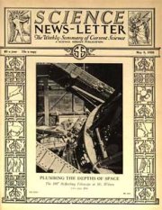
In 1926, Science News underwent its greatest change when it transformed from a mimeographed sheaf of pages to a printed newsletter that included photos.
.
.
.
.
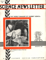
Since then, there have been occasional alterations in the table of contents, interior pages, logo, and cover. Among the recent notable changes were a cover update in 1978 and new style for the table of contents in 1997.
With recent changes in magazine-production capabilities, we can now create a livelier look that conveys scientific findings to more people than ever and gives us more flexibility to inform you of the latest research from all fields.
The design that will launch next week was created by Mariana Ochs of modesign in Rio de Janeiro. The mock cover at the beginning of this article gives you a preview of our new look.
However the appearance changes, the staff of Science News is committed to keeping you informed of what’s new to know in science each week. We look forward to continuing to provide valuable, information-packed issues.
.
.
.
.
.